UI/UX Designer
Fuel Rewards App | Shell
The Fuel Rewards program helps people save money on Shell fuel using rewards earned from everyday purchases. Members can earn additional Fuel Rewards savings when they shop, dine, book travel, and more. Rewards are cumulative, and there is no limit to how much they can save.
My Role
I was brought on as a UI/UX Designer. This project started with gathering the UX research and initial concept based off the research (done by MindSea). I then met with the developers to see what features were possible for the launch date. Once my accommodations for the app were approved by users, stakeholders (Shell) and developers. I created user flows and mockups for additional screens to handoff to developers. Then prepared the app assets for launch.
SERVICES
UX (Site Map, User Flows, Information Architecture)
Interaction Design (iOS, Android)
Visual UI (Hi-Fi Mockups)
Creative Direction (Style Guide for UI)
Prototyping (Presentations)
Annotating (Zeplin and Manual)
App Store Prep - Apple & Google Play
Image Exports, App Store Images
Client Goals
The user understands all the ways to earn fuel rewards
User understands how to get rewarded again
Increase time stayed in-app
Some special offers with affiliates cause a high bounce rate
Make the Gold/Silver Status benefit clear and concise to understand
Easy way to find In-Store offers
User Research Findings
MindSea conducted the user interviews and I sat in on some of these interviews.
Their users had issues understanding all the ways to earn fuel rewards
Users would earn rewards and not know how they obtained them
They didn’t understand how to keep Gold Status
In-Store Offers were earned accidentally
Ways to Earn
GOAL: The user understands all the ways to earn fuel rewards
EARN MORE SCREEN
The 80/20 rule was used to decide on adding ‘Earn More’ to the tab bar.
Result: The user was able to quickly find the ‘Earn More’ button and predict what was on the following screen.
HOME SCREEN
Multiple ways to earn are sectioned off on the Home screen. ‘Featured Offers’ was put above the fold so users can quickly see a way to earn right away.
Result: The user was able to identify four ways to earn in 10 seconds.
Limited-Time Offers
GOAL: Increase time spent in-app & decrease bounce rate on special offer days (T-Mobile Tuesdays)
HOME SCREEN
T-Mobile Tuesdays is a rewards program that thanks T-Mobile customers with free deals, exclusive offers, and prizes. Every week on Tuesday there’s a Fuel Rewards offer for 10¢/gal. T-Mobile users usually claim their reward and leave the app immediately. Two appealing offers were added above the fold to attract the user to stay on the app.
Result: The user tapped on the offer blurb for more information.
Gold/Silver Status
GOAL: Make the Gold/Silver Status benefit clear and concise to understand
HOME SCREEN (REWARDS BALANCE) & GOLD/SILVER DETAILS
Members with Gold Status earn 5¢/gal on every fill-up. To keep Gold Status, the member must make six fill-ups in 3 months. If they fail to do so, they will be bumped down to Silver Status. Members with Silver Status earn 3¢/gal on every fill-up.
On the current rewards balance tile on the Home Screen, there’s a dynamic label that switches between Gold and Silver status, so the user will always know what status they are. When the user taps on that label, they can learn more about their current status and how to maintain Gold Status. There’s also a fill-up counter so that they can see their progress to Gold Status.
Result: User was able to identify what status they are and how to maintain Gold Status.
In-Store Offers
GOAL: Easy way to find In-Store offers
IN-STORE SCREEN
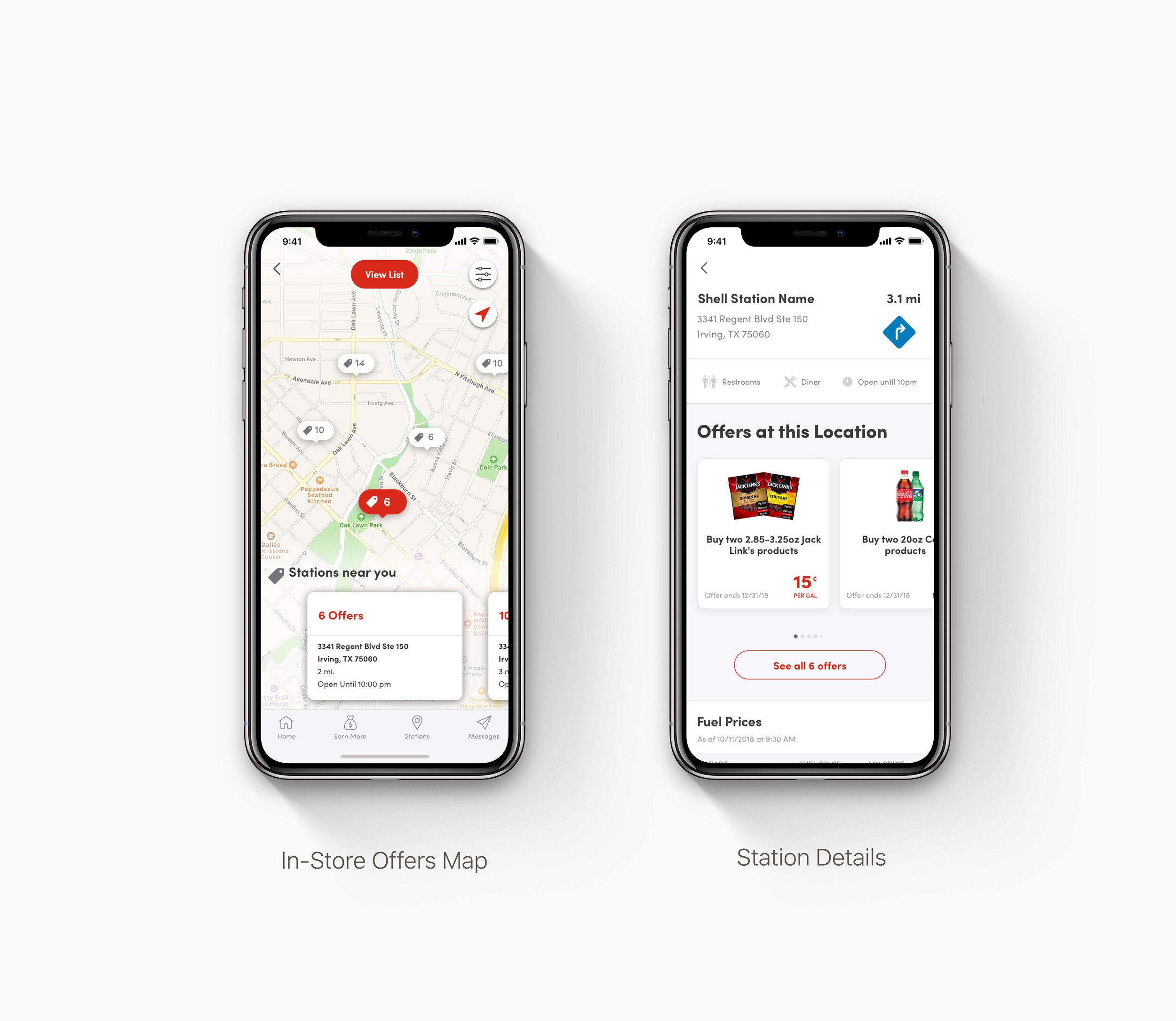
The In-Store Offers map view is a way for the user to see offers available at their nearest Shell gas station. When a location is selected, they can see the details of those offers.
Result: The user was tempted to stop by specific Shell gas locations because of a in-store offer.
Preparing For Development
API UI Accommodations
After discussion with the Excentus (PDI) developers, they decided that the initial MindSea UI concept design would not entirely work with existing Excentus APIs. We discussed app restrictions, and I made numerous UI adjustments. These accommodations were not the initial plan, but they still please the users and stakeholders (Shell) goals for the product. The accommodations allowed us to stick with the launch date, instead of pushing the launch date by several months to a year.
UX: Site Map, User Flows & Information Architecture
Once users, stakeholders, and development approved the app, I created all the additional user flows and information architecture for the app.
Additional Visual UI & Interaction Design
It was challenging creating Hi-Fi Mockups that had to work on Android and iPhone devices. Since the Fuel Rewards app is a cross-development framework, I had to continually make sure that the mockups would work well for both operating systems.
Preparing For Launch
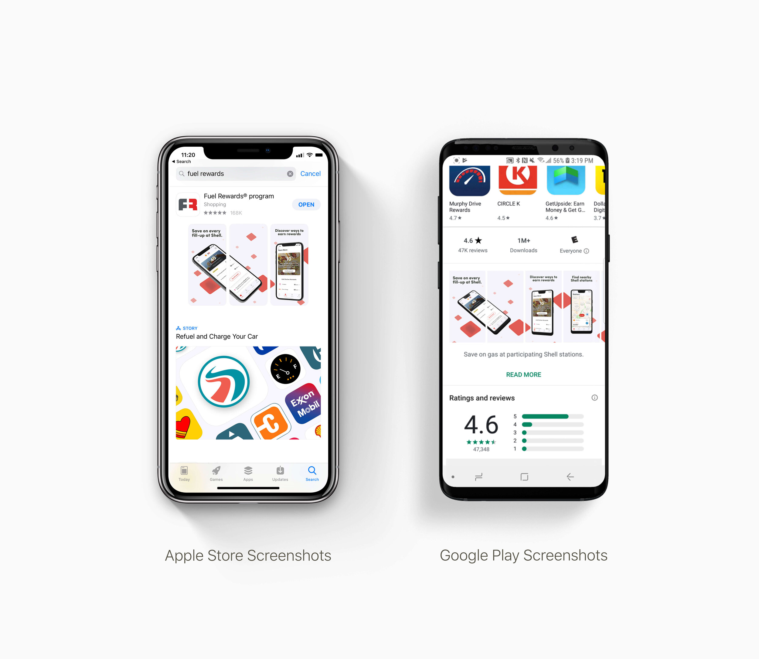
I prepared all assets for the Fuel Rewards app in Apple and Google Play app stores, which included image exports in Android and iOS formats and App Store images for both platforms.
Post Launch
The new Fuel Rewards app launched in July 2019 and is available for download on Apple and Google Play app stores.
We had a successful launch, but there’s always room for improvement with every product. We’re continuously working to make the app better. In the future, I hope that we can add in some filter features and do user testing to see how it performs.
I know how frustrating it can be to work on an existing app with no direction, so I created a style guide for the new Fuel Rewards app. The style guide has been added to a GitLab for all future designers/developers to have easy access.
I want to give a massive shout-out to my creative director Brandon Smith, MindSea, and Excentus (PDI) developers for their incredible contributions to this project.


